This home is the definition of my obsession with Pinterest and why it can be such an amazing source of inspiration. This particular homeowner is pretty much a home decorating blog and pinning junky like me, so it was great to be able to see how a DIYer translates projects, by Western bloggers who shop at Lowe’s and Home Depot, to a place where you can’t always find what you want.
This space is beautiful, eclectic, and full of unique items designed and created by the homeowner. I’m truly inspired by this home. I think it’s time for me to become a Saudi DIYer!
Years in Saudi: 2 years overall… 1.5 years decorating
Inspiration: Lots of light, open and airy spaces.
I follow tons of different home decorating blogs. Pinterest is definitely a source of inspiration for me.
Style:
It’s really whatever I like. I don’t really feel like I have a style. Or it’s just based off whatever blog I happen to be reading that day!
This homeowner clearly loves light. It was wonderful to see her bright and airy house in a place where lots of people are trying to block out the sun with heavy drapery. She uses long linen curtains on all of her windows to keep that open and breezy feel.
She also seems to love using different textures. Color is used as an accent for most of her neutral furniture, but it’s primarily the texture of her furniture and her décor items that give this space a trendy and stylish look. As you will see in the pictures, she’s changed a lot of lighting fixtures as well as furniture fixtures to add character to her space. Even her walls are covered with a beautiful wood paneling!
What I simply adore about this homeowner is that she seems to have invested so much time and effort in making this a happy and homey space. It was amazing to immediately feel that vibe when I first walked in. I hope you enjoy seeing the character and trendiness of this home as much as I did!
Home & Garden Tour

The homeowner made her own chalkboard paint and used it to cover all of the walls of her entryway. The knobs were changed out of the white HEMNES shoe cabinet with gold knobs, so that it didn’t look so typically Ikea! Info on how to make your own chalkboard paint is in the Q&A section below.
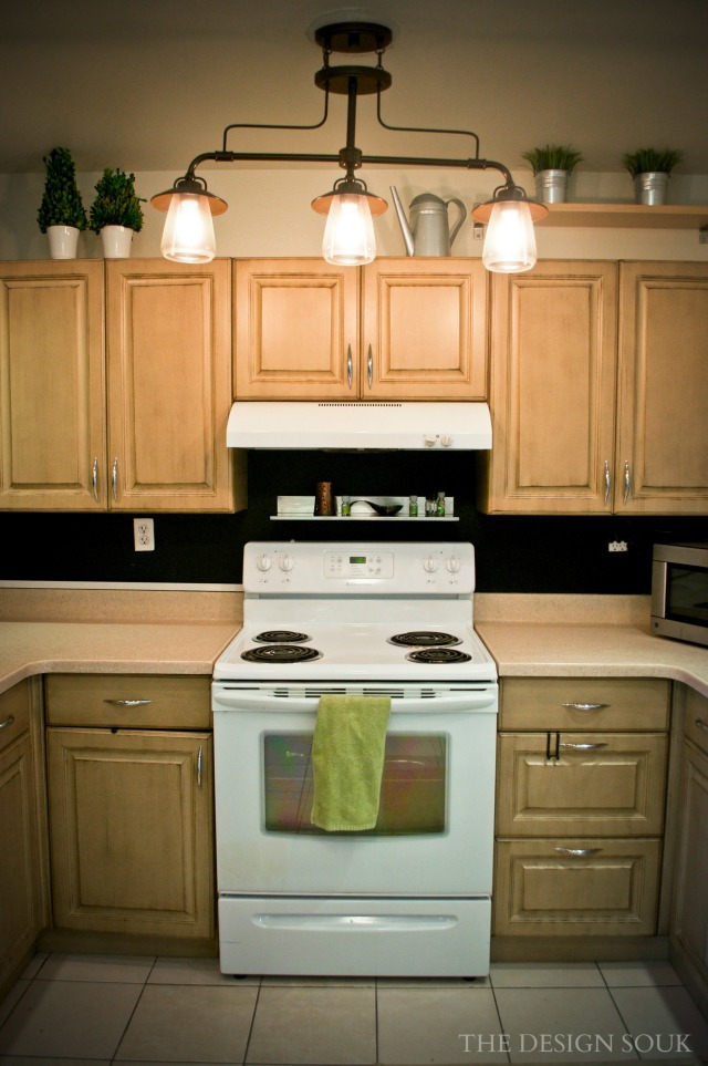
The color of the custom kitchen cabinetry and retro lighting fixture give this kitchen a comfortable and open feel. I also love that the space above the cabinets has been used! The décor and shelving add some much needed height to the low ceilings that we see in some of these compound homes.
What is so great about the breakfast nook is that it’s mixing and matching at its best. There are acrylic chairs and a wooden table purchased from Ikea, a painted wooden bench that’s actually a TV stand, as well as another trendy lighting fixture from Lowe’s. There’s yet another chalkboard in the space and a magnetic board (spray-painted gold) for family pictures. And to top it all off, on the other side of the wall is an amazing Restoration Hardware baker’s rack.
The “faux shades” on the window are actually pieces of cloth that were stitched together to give the illusion of roman shades. It gives the homeowner an inexpensive way to put up some color, and allows her to change it out without having to spend a lot!
Once we move out of the kitchen, you come straight into the dining room, which is split up into three different spaces. There’s a bar area, a small seating area, as well as another seating area with stools and a gorgeous wooden table. The bar area has a beautiful Pottery Barn bar with bar stools, 2 sets of Pottery Barn mirrors on the back wall, as well as a stunning Restoration Hardware lighting fixture hanging over the bar as the ultimate statement piece.
Overall, the space has a stylish yet informal vibe to it – definitely a great spot for a party!
I love that this living room works so seamlessly with the dining room décor. But the boldest statement in the entire house is the amazing paneled wall! The homeowner did it herself, and got all of the material from wood shops on King Khalid Street. She even did the moldings on her walls herself!
For instructions on how to make your own paneled wall, check out the Q&A below.

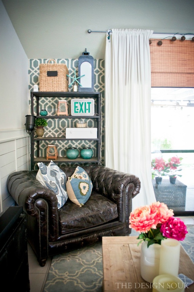
The wall behind the shelf is actually made of material! It was stapled to the wall by the homeowner. Check out the Q&A below for more info.
There’s a beautiful study off of the living room as well. The homeowner has 2 little children, so being able to work and watch the kids in one space is perfect for any mommy.
The paneling even continues on into the bedrooms!
I’m so impressed by how personalized the master bedroom is, and how calculated the colors look in the space. The homeowner has been able to use beautiful bright colors by balancing it all out with different textures. Doesn’t it work so well?
Check out the pictures below to see how much work the homeowner did herself to add character to her bedroom. You have to see the master closet as well…
And just when you thought it couldn’t possibly get any better… you find the baby’s room! I would want to be a baby in this room. I’m not kidding. It’s so trendy and colorful!
The Ikea frames in this room were painted with chalk paint in different ombre colors with prints from Etsy. The deer heads were also a purchase from Etsy. The cribs were bought from Pottery Barn and were originally pink on the ends. The ends were then chalk painted teal to match the ombre wall!
A Chat with the Homeowner
How did you come up with the design for your home?
It started with the paneling. I follow a blog called “The Lettered Cottage,” and I really liked the cottage feel of that, so that’s what got me started. We really just wanted it to feel like we were home. I wanted people to walk in and think that we uprooted our house and planted it here from America.
Being a DIYer… What’s your favorite DIY item?
I love my paneling. And once you get all the measurements right for the wooden boards, it can take 40 minutes to do a wall.
The material I stapled to the wall is probably one of my favorite projects though, especially because it adds texture, was easy to install, and is easy to replace. You don’t even ruin the material and can repurpose it for later. For anyone planning to do this project though, do not get stripes or something that needs to be aligned or level to look right. If you get a pattern or print, make sure it doesn’t have to be level or it’ll take you forever. My material wall took me a total of 20 minutes. I have staple guns, nail guns and lots of other good tools for these kinds of DIY activities.
If you can’t find it, where do you go?
I usually pay for extra luggage especially when family members are coming to visit. I tried using Aramex, but it becomes a little expensive and you have to wait a while to find the best deals for shipping. It’s hard for a DIYer to work like this because you’re constantly changing things and having to wait is not easy.
How do you make your own chalk paint?
You need…
Black Paint (water-based) any finish (flat, glossy, semi-gloss)
Non sanded fine or super fine grout – can buy this from Abayat (For lighter colors, use white/almond non sanded grout; For darker color, use dark grout) Make sure it’s non sanded!
The recipe is 2 tbsp. of non sanded grout to 1 cup of paint. It only stays usable for about 4 hours (dries out very fast), so keep mixing well as you go! You can add the mix to a jar, place the lid on it and shake well.
How did you do your paneled wall?
My inspiration was from The Lettered Cottage. I started off by going to a wood shop in Khobar, and asked for MDF boards, about ¾ inch thick. I had them cut them into strips so that I didn’t have to do it myself. I have an air gun and a nail gun, as well as my own compressor, so once I got all the pieces, one wall took me 40 minutes to do. I used wood putty to cover up the holes and then painted it white. Personally, I love the look of the longer planks, and not the shorter ones behind the TV.
Tips & Tricks:
- Don’t be close-minded. Midas is not my favorite, but individual pieces can work well in your house. Go in with an idea of what you want. When you see a piece of furniture, try to picture it somewhere in your house.
- Look at the shape of the furniture versus what it is labeled as. I use a TV stand as a bench in my breakfast nook. The shape of the furniture matters more – it can be used in a variety of ways for different purposes.
- Try to decorate with texture. Do what you feel. If you like a piece of furniture, I guarantee, it’ll work well with your space. You will only put in your space things that you really like anyway, so what you like will naturally be unified.
- I change my pillows with the seasons. It’s a pretty inexpensive way to decorate.
For people with kids…
- If you’re getting IKEA stuff, make sure to bolt it to the wall. Also, remember that you have a tile backing on the floor, making it difficult to drill into the wall. I used a wooden brace to drill into the wall.
- Stick with dark furniture. I keep my walls white, and use natural wood for most of my furniture. If you get scuff marks or scratches on it, it just adds to the character of the piece. My kids can scratch at it all day and it wouldn’t make a difference. I also don’t allow food and drinks outside of the kitchen.
- Decorate with baskets. The kids can bite them, twist them, scratch them, and it’s totally fine.
Places to Check Out:
MARINA in Bahrain for ideas. It’s very expensive, but if you can find accent pieces that’ll fit in your car, bring them back with you.
Pottery Barn. Zara Home. Ikea. Midas and ID Design are not my favorites, but you can make a couple accent pieces from there work for your home if you stay focused on what you need. It’s hard if you’re looking for something modern, since there are limited places to buy stuff, but this is what we’ve been given, so work with it!


 How I Decorate for Fall
 A Shabby Chic Home & Garden Tour
 How I Organized My Pantry and My Favorite Storage Tools

[…] A Pinterest-y Inspired House […]